Friday, December 7, 2018

Data Tables in Excel 2010

In Excel, a Data Table is a way to see different results by altering an input cell in your formula. Data tables are available in Data Tab » What-If analysis dropdown » Data table in MS Excel.
Protect Workbook

Data Table with Example

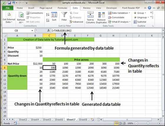
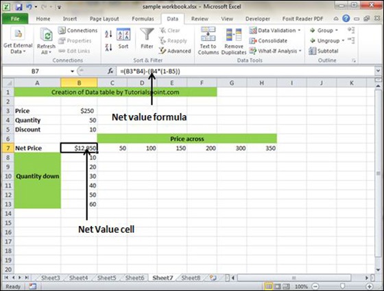
Now, let us see data table concept with an example. Suppose you have the Price and quantity of many values. Also, you have the discount for that as third variable for calculating the Net Price. You can keep the Net Price value in the organized table format with the help of the data table. Your Price runs horizontally to the right while quantity runs vertically down. We are using a formula to calculate the Net Price as Price multiplied by Quantity minus total discount (Quantity * Discount for each quantity).
Data table Example
Now, for creation of data table select the range of data table. Choose Data Tab » What-If analysis dropdown » Data table. It will give you dialogue asking for Input row and Input Column. Give the Input row as Price cell (In this case cell B3) and Input column as quantity cell (In this case cell B4). Please see the below screen-shot.
Data table Example
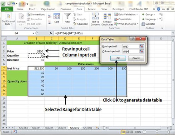
Clicking OK will generate data table as shown in the below screen-shot. It will generate the table formula. You can change the price horizontally or quantity vertically to see the change in the Net Price.
Data table Example

Pivot Tables in Excel 2010


Pivot Tables

A pivot table is essentially a dynamic summary report generated from a database. The database can reside in a worksheet (in the form of a table) or in an external data file. A pivot table can help transform endless rows and columns of numbers into a meaningful presentation of the data. Pivot tables are very powerful tool for summarized analysis of the data.
Pivot tables are available under Insert tab » PivotTable dropdown » PivotTable.

Pivot Table Example

Now, let us see Pivot table with the help of example. Suppose you have huge data of voters and you want to see the summarized data of voter Information per party, then you can use the Pivot table for it. Choose Insert tab » Pivot Table to insert pivot table. MS Excel selects the data of the table. You can select the pivot table location as existing sheet or new sheet.
Pivot Table
This will generate the Pivot table pane as shown below. You have various options available in the Pivot table pane. You can select fields for the generated pivot table.
Pivot Table Structure
  • Column labels − A field that has a column orientation in the pivot table. Each item in the field occupies a column.
  • Report Filter − You can set the filter for the report as year, then data gets filtered as per the year.
  • Row labels − A field that has a row orientation in the pivot table. Each item in the field occupies a row.
  • Values area − The cells in a pivot table that contain the summary data. Excel offers several ways to summarize the data (sum, average, count, and so on).
After giving input fields to the pivot table, it generates the pivot table with the data as shown below.
Pivot Table Example Data

Simple Charts in Excel 2010


Charts
A chart is a visual representation of numeric values. Charts (also known as graphs) have been an integral part of spreadsheets. Charts generated by early spreadsheet products were quite crude, but thy have improved significantly over the years. Excel provides you with the tools to create a wide variety of highly customizable charts. Displaying data in a well-conceived chart can make your numbers more understandable. Because a chart presents a picture, charts are particularly useful for summarizing a series of numbers and their interrelationships.

Types of Charts

There are various chart types available in MS Excel as shown in the below screen-shot.
Charts
  • Column − Column chart shows data changes over a period of time or illustrates comparisons among items.
  • Bar − A bar chart illustrates comparisons among individual items.
  • Pie − A pie chart shows the size of items that make up a data series, proportional to the sum of the items. It always shows only one data series and is useful when you want to emphasize a significant element in the data.
  • Line − A line chart shows trends in data at equal intervals.
  • Area − An area chart emphasizes the magnitude of change over time.
  • X Y Scatter − An xy (scatter) chart shows the relationships among the numeric values in several data series, or plots two groups of numbers as one series of xy coordinates.
  • Stock − This chart type is most often used for stock price data, but can also be used for scientific data (for example, to indicate temperature changes).
  • Surface − A surface chart is useful when you want to find the optimum combinations between two sets of data. As in a topographic map, colors and patterns indicate areas that are in the same range of values.
  • Doughnut − Like a pie chart, a doughnut chart shows the relationship of parts to a whole; however, it can contain more than one data series.
  • Bubble − Data that is arranged in columns on a worksheet, so that x values are listed in the first column and corresponding y values and bubble size values are listed in adjacent columns, can be plotted in a bubble chart.
  • Radar − A radar chart compares the aggregate values of a number of data series.

Creating Chart

To create charts for the data by below mentioned steps.
  • Select the data for which you want to create the chart.
  • Choose Insert Tab » Select the chart or click on the Chart groupto see various chart types.
  • Select the chart of your choice and click OK to generate the chart.
inserted Chart

Editing Chart

You can edit the chart at any time after you have created it.
  • You can select the different data for chart input with Right click on chart » Select data. Selecting new data will generate the chart as per the new data, as shown in the below screen-shot.
Select different data
  • You can change the X axis of the chart by giving different inputs to X-axis of chart.
  • You can change the Y axis of chart by giving different inputs to Y-axis of chart.

Wednesday, December 5, 2018

Pivot Charts

A pivot chart is a graphical representation of a data summary, displayed in a pivot table. A pivot chart is always based on a pivot table. Although Excel lets you create a pivot table and a pivot chart at the same time, you can’t create a pivot chart without a pivot table. All Excel charting features are available in a pivot chart.
Pivot charts are available under Insert tab » PivotTable dropdown » PivotChart.

Pivot Chart Example

Now, let us see Pivot table with the help of an example. Suppose you have huge data of voters and you want to see the summarized view of the data of voter Information per party in the form of charts, then you can use the Pivot chart for it. Choose Insert tab » Pivot Chart to insert the pivot table.
Pivot Chart Structure
MS Excel selects the data of the table. You can select the pivot chart location as an existing sheet or a new sheet. Pivot chart depends on automatically created pivot table by the MS Excel. You can generate the pivot chart in the below screen-shot.
Pivot Chart Data

MS Excel Keyboard Short-cuts

MS Excel offers many keyboard short-cuts. If you are familiar with windows operating system, you should be aware of most of them. Below is the list of all the major shortcut keys in Microsoft Excel.
  • Ctrl + A − Selects all contents of the worksheet.
  • Ctrl + B − Bold highlighted selection.
  • Ctrl + I − Italicizes the highlighted selection.
  • Ctrl + K − Inserts link.
  • Ctrl + U − Underlines the highlighted selection.
  • Ctrl + 1 − Changes the format of selected cells.
  • Ctrl + 5 − Strikethrough the highlighted selection.
  • Ctrl + P − Brings up the print dialog box to begin printing.
  • Ctrl + Z − Undo last action.
  • Ctrl + F3 − Opens Excel Name Manager.
  • Ctrl + F9 − Minimizes the current window.
  • Ctrl + F10 − Maximize currently selected window.
  • Ctrl + F6 − Switches between open workbooks or windows.
  • Ctrl + Page up − Moves between Excel work sheets in the same Excel document.
  • Ctrl + Page down − Moves between Excel work sheets in the same Excel document.
  • Ctrl + Tab − Moves between Two or more open Excel files.
  • Alt + = − Creates a formula to sum all of the above cells
  • Ctrl + ' − Inserts the value of the above cell into cell currently selected.
  • Ctrl + Shift + ! − Formats the number in comma format.
  • Ctrl + Shift + $ − Formats the number in currency format.
  • Ctrl + Shift + # − Formats the number in date format.
  • Ctrl + Shift + % − Formats the number in percentage format.
  • Ctrl + Shift + ^ − Formats the number in scientific format.
  • Ctrl + Shift + @ − Formats the number in time format.
  • Ctrl + Arrow key − Moves to the next section of text.
  • Ctrl + Space − Selects the entire column.
  • Shift + Space − Selects the entire row.
  • Ctrl + - − Deletes the selected column or row.
  • Ctrl + Shift + = − Inserts a new column or row.
  • Ctrl + Home − Moves to cell A1.
  • Ctrl + ~ − Switches between showing Excel formulas or their values in cells.
  • F2 − Edits the selected cell.
  • F3 − After a name has been created F3 will paste names.
  • F4 − Repeat last action. For example, if you changed the color of text in another cell pressing F4 will change the text in cell to the same color.
  • F5 − Goes to a specific cell. For example, C6.
  • F7 − Spell checks the selected text or document.
  • F11 − Creates chart from the selected data.
  • Ctrl + Shift + ; − Enters the current time.
  • Ctrl + ; − Enters the current date.
  • Alt + Shift + F1 − Inserts New Worksheet.
  • Alt + Enter − While typing text in a cell pressing Alt + Enter will move to the next line allowing for multiple lines of text in one cell.
  • Shift + F3 − Opens the Excel formula window.
  • Shift + F5 − Brings up the search box.

SBR Notes IAS 16

IAS 16: Property, plant and equipment Ø   Definition Ø   Initial Measurement Ø   Subsequent Measurement 1.        Cost 2.      ...